Part 4 Neutral Colors - The Psychology of Neutral Colors in Branding and Marketing
Neutral colors are great to mix with cool or warm colors; their pale nature can soften an intense red or a violet-blue. In addition, neutral colors are often used on websites to tone down the more overpowering characteristics of strong red logos and overpowering fluorescent lipstick pink highlights.
Colors express the main psychic functions of man.
- Carl Jung.
The Color Psychology of Grey
Grey symbolizes a gamut of meanings; depending on its particular shade and color, tint, tone, and hue; from real timelessness, neutrality, reliability balance intelligence to security, staid, modesty, dignity, maturity, solid, conservative, practical, old age, sadness, boring, practicality, professional, sophisticated, durability, quality, quiet, conservativeness, to gloominess, and grief.
Greys and silvers are the most common colors used on websites because they symbolize a broad range of emotions and meanings and can match any other color.
Use of Grey in Website Design
Vermeulen’s older website, which we designed back in 2015, was a classic example in grey utilizing a three-column format in slate grey with white and a touch of olive green. The website design portrayed professionalism, experience, knowledge, trust built around being the industry experts.
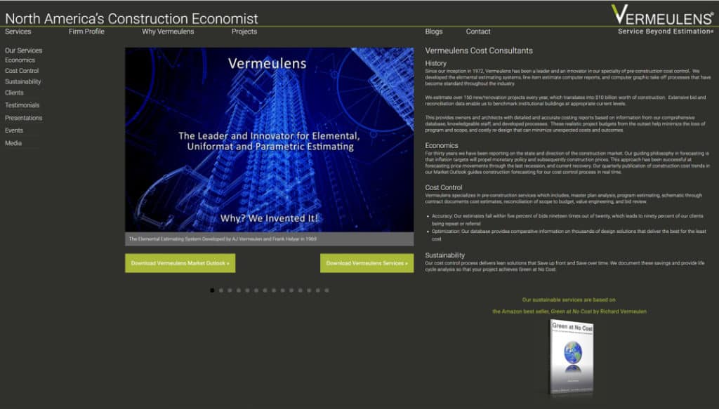
Vermeulen's updated site continues this theme in a more contemporary fashion. As an observation, the newer stylized theme is a little too grey and depressing it could do with a touch of excitement, a splash of red.. What do you think?
Like beautiful melodies and poignant words,
color draws from the deep emotions within us.
- Joen Wolfrom.
FREE Branding and Marketing Webinar
CTA Join us on our FREE Monthly Marketing Webinar, 101 Marketing Strategies, a Monthly Marketing Webinar every last Thursday of the month, and share your thoughts on the Color Psychology in Branding, Marketing, and Sale.
Part 4 Neutral Colors - The Color Psychology of Grey
The Color Psychology of Grey
- Neutral Grey – Timelessness, Neutrality, Reliability, Balance, Intelligence, Strength, and Trust. Note this is a slate grey to match the olive green of the logo.
- Silver Grey – Glamorous, Distinguished, High-Tech, Industrial, Graceful Aging, Intuition, Dreams, Communication, Sleekness, and Modernity.
- Neutral Grey – Timelessness, Neutrality, Reliability, Balance, Intelligence, Strength, and Trust.
- Negative Dark Greys – Unconfident, Dampness, Depression, Hibernation, Lack of Energy, and Blandness.
There are over “50 Shades of Grey” for every Occasion and Web developer’s needs!
They are safe colors, and when used in combination with other colors, they can create an honest, trustworthy, established firm like Vermeulen’s that looks high-tech and modern. In addition, silver/grey can be used to complement gold and white to promote a feeling of control and power, so it is not surprising that jewelry firms, and legal websites, or finance-related utilize these colors.
There are no grey issues. Life is black, and it's white. There's no in-between.
- Zakk Wylde.
Black
Black symbolizes many different emotions, from sophistication, with a touch of gold, silver, or white, to security, power, elegance, authority, substance, and dark negatives of oppression, coldness, menace, heaviness, mourning, evil.
There is a shade of black for every emotion and feeling from protection, power, sexuality, sophistication, formality, elegance, classy, wealth, mystery, fear, evil, depth, style, modern, space, high quality, dramatic, authority, prestige, grief, reliability, classic, strength, and severe.
If I could find anything blacker than black, I'd use it.
- J. M. W. Turner.
The Color Psychology of Black in Website Design
NEED HELP IMAGINEERING YOUR BRAND
CALL the Branding Knowledge Experts Today!
Cutting edge, hidden secrets, lust, and sophistication, remember that little black cocktail dress! Thank Coco Chanel for the invention.
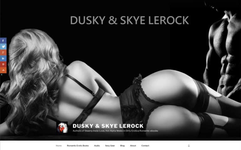
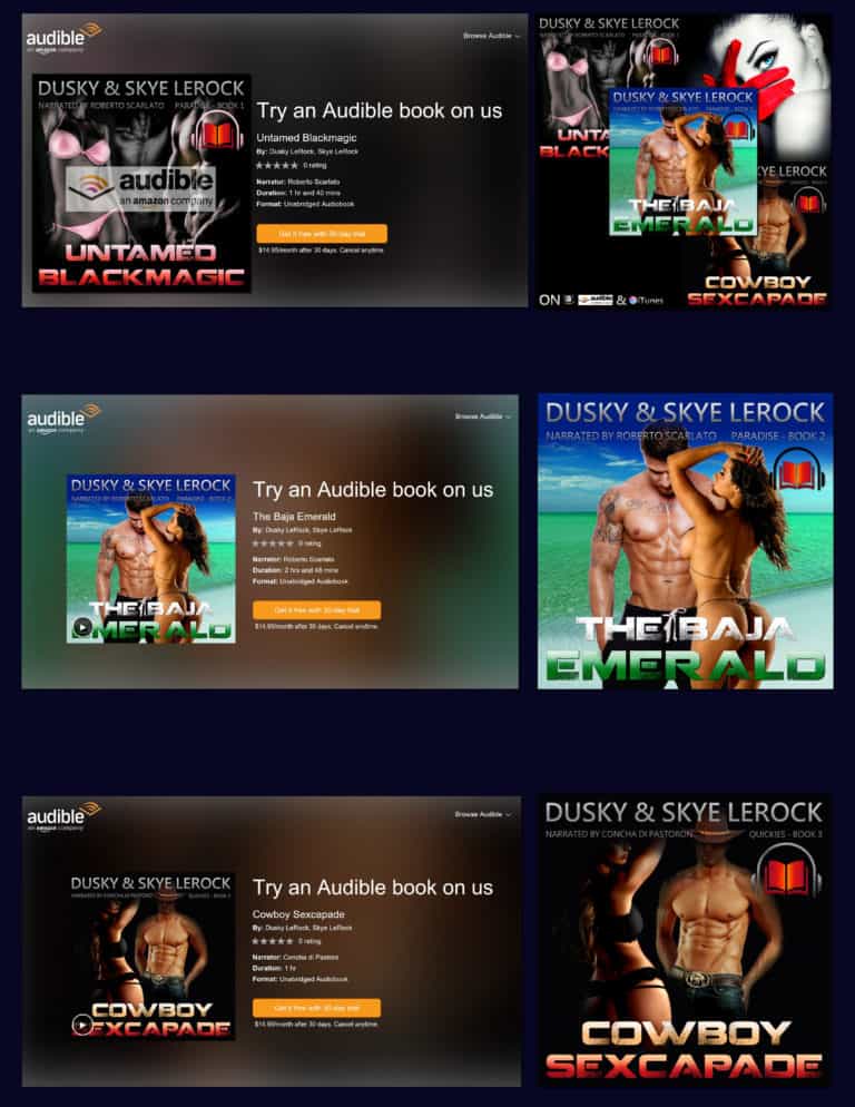
For Dusky and Skye LeRock, we developed a timeless look, sexy but chic. In hindsight, we could add more red accents to heat the action. Fortunately, the SEO copy and graphics are laced with innuendos and hot steamy connotations.
Black is the new sophisticated grey on many websites that convey a sense of forbidden luxury, sophistication, and elegance. Architects will tell you that black shows off their presentations and portfolios better than any other color. But which shade of black?
Add Red and a touch of Turquoise Blue and watch the image Pop
Computer chipboard manufacturers to car companies and professional artistic products and services from music-related websites to photographers feature black as timeless. Its cutting-edge appeal hits all genres and ages, including the youth market.
Expert Tip: Impulse shoppers tend to gravitate toward black, red-orange, and royal blue. This is evidenced by the colors found in fast food, outlet malls, and clearance sales.
The Psychology of Black In Book Cover Design and Marketing Media
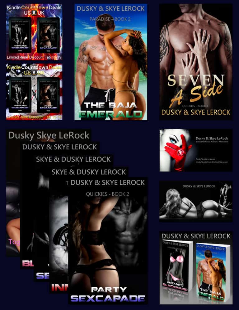
Black evokes the feeling of authority, power, and a sophisticated lifestyle. Dark cocktail dress, black suit, and tinted car windows. And of course, the little black dress. Fifty shades of grey and black are also associated with the dark side of obsession and power. Throw in some red and a tease of blue, and you have an avatar for the nom de plume.
All books need to have professional Editorial and Editing services. We are happy to provide their services to all genres of books
Black is like a broken vessel, which is deprived of the capacity to contain anything.
- Leonardo da Vinci.
The Psychology of Neutral Colors in Display Ads and Banners
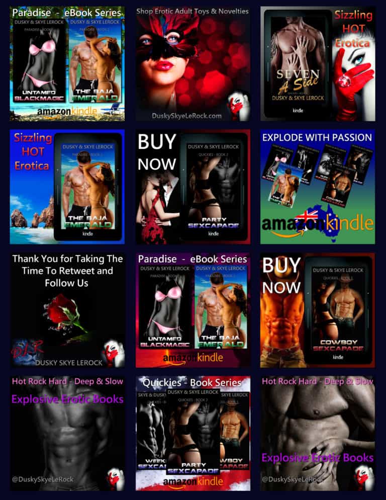
We can see from the examples above that the dash of red adds excitement to the branded Twitter banner ads off Dusky Skye LeRocks promotional materials. The Brand voice and visual identity flow through all their marketing and sales materials. The neutral silver-grey text adds a touch of sophistication.
Banner ads and Displays need to be Eye-catching
Expert Tip: Use color to reinforce brand identity.
Psychology Neutral Color Design in Packaging
Neutral colors are not generally attention grabbers in packaging. But the Apple iPhone 13 Pro Max uses "Graphite, Gold, Silver, and Sierra Blue" as luxury eyecatchers.
An abstract study, the Neutral Correlates of Impulsive Buying Tendencies during Perception of Product Packaging, showed that:
-
-
Attractive packaging triggered more intense activity in areas of the brain associated with impulsivity than neutral packaging.
-
Unattractive and attractive packaging lead to less activity in areas of the brain responsible for reflective thought than neutral packaging.
-
Attractive packaging triggered reward responses in the brain, whereas unattractive packaging triggered areas associated with negative emotion.
-
Use color to create the appropriate Emotional association
-
Use texture and touch in packaging to evoke a reaction.
-
Color and texture Evokes Emotion in All Design
The Color Psychology of Brown in Website Design
Brown is the color of dirt, earth, earthiness, reliability, and authenticity; it is a warm, soothing color that symbolizes a wide range of emotions. When used well in combination with green, it excels. We believe we used the color well when we Imagineered Dry-fly Marks website.
This mystic quality of color should... find expression in a work of art.
- Hans Hofmann.

The Wooden Wish is an exemplary example of browns, clean white with hunter-green accents in a branded custom website design that speaks of craftsmanship. What Do You Think?
We Imagineered Mark's brand to reposition him from a carpenter to a master craftsman utilizing branded content, images, and graphics to tell his story.
The Finest Unique Handmade Furniture and Wood Art Made in America from
Recycled Eco-friendly Urban Wood
The emotional symbolism ranges from friendships, earth, hearth, home, outdoors, reliability, credibility, comfort, endurance, stability, simplicity, longevity, intimacy, tranquility, masculine, nurturing, contentment, strength, passivity, fertility, generosity, practicality, challenging work, to humorlessness, heaviness, unsophisticated, sadness, dirtiness, and depression.
Expert Tip: Gloomy-Poopy-brown should be avoided like the plague! Watch a child mix all the beautiful colors of the rainbow, and what will you get? Shit-brown. So be careful how you use it.
The Psychology of Tones and Hues Of Brown
- Beiges and Tans – Sophistication, Seriousness, Warmth, Earthiness, Reliability, Support, Authenticity, and Neatness.
- Fresh Copper Brown (Note this is before it ages and turns green) – Passion, Money Goals, Professional Growth, Business Productivity, and Career Moves.
- Dark Browns – Sophistication, Richness, Robustness, and Nature.
- Muddy Browns – Humorlessness, Heaviness, Unsophisticated, Sadness, Dirtiness, and Shit.
Brown is often found on a variety of websites. Brown is particularly appealing when mixed with black, so darker shades are used on websites for sophisticated and professional products.
Lighter browns are often used to denote neatness and tidiness; companies that tidy your cupboards or sell products that do well tend to use these shades of brown.
Medium browns mixed with greens can be used on websites relating to nature, nuts, and food, along with agricultural products.
Muddy it All Together with Brown!
The Color Psychology of White in Design
The color of space, “White Space.” White can have many shades that put grey to shame. White represents positive, cleanness, clarity, purity, simplicity, sophistication, and freshness.
Light is a thing that cannot be reproduced but must be represented by something else – by color.
- Paul Cezanne
In some society’s white symbolizes death. Cold white hues can be negative, giving a feeling of sterility, cold, unfriendly, elitist, isolated, and emptiness.
White is the most complex color for Architects and Interior Designers to deal with. White is unforgiving.
Manufacturers and the cosmetic industry are so concerned and obsessed with white that they put titanium nanites, a whitening agent, in their products to make them more appealing.
Titanium White The Light behind Impressionist Painters
When Peter paints, he follows the impressionists like Renoir and Monet who used titanium white as it is the cleanest brilliant white and helps create a greater awareness of light, vibrant color, and the shifting pattern of the scene like an impressionist painting.
There are primarily two white shades, warm white, an old-fashioned tungsten light bulb, and cold white, a fluorescent light, so tread carefully with white as it picks up the color and hue next to it.
The Psychology of Color is a Powerful Tool in Design and Branding;
Make Sure You and Your Designer Choose Well.
So, now you can see how colors can influence the message you are trying to send and convey through your website.
A great deal of psychology goes into designing a great website, and the color choices are just one of the decisions that will affect your visitor’s perception of your firm.
When creating a website, all the firm's branding must be considered, including well-written content.
Learn the Secret to
Color Psychology for Content Branding, Marketing, and Sales?
Read the 4-part how-to guide to Color Symbolism in Brand IMAGINEERING. We share how it affects Your Brand voice, visual identity, and equity, from logos to your custom website design, content branding, search engine optimized copy, and more. In addition, BD, marketing, sales, and services, we answer what color psychology is and how the primary colors influence your emotions, choices, and perceptions.
4-part series of Color Symbolism in Brand IMAGINEERING
and how it affects Your Brand Voice, Visual Identity, and Equity,
from Logos to Website Design, BD, Marketing, Sales, and Services
A 4-part How-to Guide to Color Symbolism in Brand IMAGINEERING
Part 1 Primary Colors - The Psychology of Primary Colors in Branding and Marketing
Part 2 Warm Colors - The Psychology of Warm Colors in Branding and Marketing
Part 3 Cool Colors - The Psychology of Cool Colors in Branding and Marketing
Part 4 Neutral Colors - The Psychology of Neutral Colors in Branding and Marketing
Discover Brand Imagineering
Your Brand Colors and What They Mean to Your Customers
Your Brand Voice, Visual Identity, and Equity
In this 4 part how-to-guide, we share the best ways to find and select your brand color pallet with the twelve (12) most used colors and the emotions to create your branding color scheme from Content Branding Solutions
We show proven expert tips to consider when using color in content creation and marketing and sales copy, websites, website design, book covers, logos, download, and sales buttons to get you the results and benefits you and your brand deserve.
We provide Expert Tips That have value, with proven benefits to consider when using color for logos, website development, design, book covers, marketing graphics for social media, LinkedIn, Twitter, Meta (Facebook), etc.
Your Knowledge about the Psychology Color can Become Your Marketing Game-Changer...
Discover Content Branding Solutions
a
BRAND IMAGINEERING Digital Creative Agency
We DON'T JUST Create MEDIA CONTENT
We will Help You IMAGINEER Your BRAND
A creative agency is an organization that uses innovative strategies to help clients achieve their goals. Creative agencies are sometimes called marketing agencies.
BRAND IMAGINEERING
Discover Content Branding Solutions ▪ Brand Imagineering ▪ Digital Creative Agency
We Imagineer Brands by repositioning You to give You the Competitive Advantage utilizing Branded Content, Images, and Graphics to tell Your Story and the Vision of Yourself You Wish to Portray.
We are Experienced Content Writers. We have published content for multiple genres, including TV, Radio, and Multimedia. In addition, we Write Blogs, eBooks, White papers, Custom Case Studies, and Emails with creative, eye-catching graphics.
We share our love of Persuasive Words and Graphics to Empower You to Act.
Discover the Best Ways to Get Results - Together We Imagineer Your Brand.
What-Is-a-Creative-Agency-A-how-to-guide-to-find-the-Best-Marketing-Agency-by-Content-Brandinng-Solutions-RV3-02_06_2023

