Part 3 Cool Colors - The Psychology of Cool Colors in Branding and Marketing
Part 3 Cool Colors - The Psychology of Cool Colors in Branding and Marketing. In Part 3, Cool Color Symbolism in Design and Marketing, we look at the psychology of cool colors in branding marketing and sales. Cool color psychology is associated with cold elements such as water blue, cool green, purples, and greys. These elements and colors instill feelings and emotions of calmness, nature, relaxation, and rejuvenation. However, the psychology of colors in branding and marketing can have positive or negative connotations, from cool colors in brand imaging that are ice-cold for a soft drink that quenches your thirst on a hot day to that hunter green jacket that speaks of a love for nature. Therefore color symbolism in design and marketing and color in content creation matter.
Build Your Brands Visual Identity With Brand IMAGINEERING Using Color
Before you brand your firm or refresh your brand or professional practice is essential to understand the psychology of cool colors and the role of color in your brand Imagineering, brand voice, visual identity, and brand equity. Think about how color psychology and symbolism influence your target market's thoughts and trigger a positive sales reaction?
The “Psychology of Color in Branding” affects your business development, public relations, marketing, sales, and services.
Get Proven Marketing and Sales Results
By Leveraging
Color Symbolism in Design and Marketing for Your ROI
Capture the financial value that brand Imagineering and color psychology can bring to your firm’s bottom line and ROI. Use color in Brand Imagineering with color symbolism in marketing to attract, retain and convert your target market. Get proven results using the correct color in content creation and color symbolism in design and marketing.
Before you choose your Brand colors, see how others may perceive you and your products.
Imagineering Your Brand - Brand Color Psychology Visualization
Are You Imagineering Your Brand?
Are You Utilizing the Psychology of Color to Build Trust in Your Brand?
Are You Utilizing Color Symbolism in Design and Marketing for Your Success?
Want to know more about Color Symbolism in Design and Marketing for Your Success?
Every person and business is or should be a brand. Likewise, each entity is a brand, from social influencers, celebrities, entrepreneurs, and thought leaders to start-ups and small companies.
Together, we imagineer your brand; together, we visualize your brand and products to create branding that crosses all departments and media for your firm.
Branding is a Marketing System where a Company Creates a Name, Slogan, Symbol, or Design that is
Easily Identifiable as Belonging to the Company.
Build Your brand around your thought leadership, your firm's strengths, trendsetting designs, and people. People buy people they know, like, and trust.
Don't Build a Business - Build a BRAND.
Our goal is to make you and your team the knowledge experts to increase reach, market positioning, and share affordably.
What Can Branding and Color Psychology Do for Your Brand?
- Branding Creates Recognition
- Branding Increases Your Business Value
- Branding Creates Trust within the Marketplace
- Branding Supports Advertising
- Create Branding that Sends the Right Message- Your Company Message
- Branding can Improve Employee Pride and Satisfaction
- Branding is the sum of all parts that elevates a product above its competition
Build a Brand on Timeless Messaging Using Color Psychology;
to Make Your Businesses Goals Come True
Color and Consumer Purchases
Cool Grey: The experts suggest that people who drive grey cars don't want to stand out and instead prefer something a bit more subtle.
Stevens Gans, MD. Color Psychology: Does It Affect How You Feel?
Cool Color Symbolism in Design and Marketing
The Color Psychology of Cool Colors
Cool colors are made up of shorter wavelengths and can be calming or cold and impersonal to the viewer. Unfortunately, many brands and website designs often overuse the cool color spectrum.
Colors on the blue side of the spectrum are known as cool colors and include blue, purple, and green.
These colors are often described as calm but can also call to mind feelings of sadness or indifference.
- Stevens Gans, MD. Color Psychology: Does It Affect How You Feel?
All designers need to be careful not to overuse cool tones and colors without offsetting them against a warm color tone.
The Color Psychology of Green
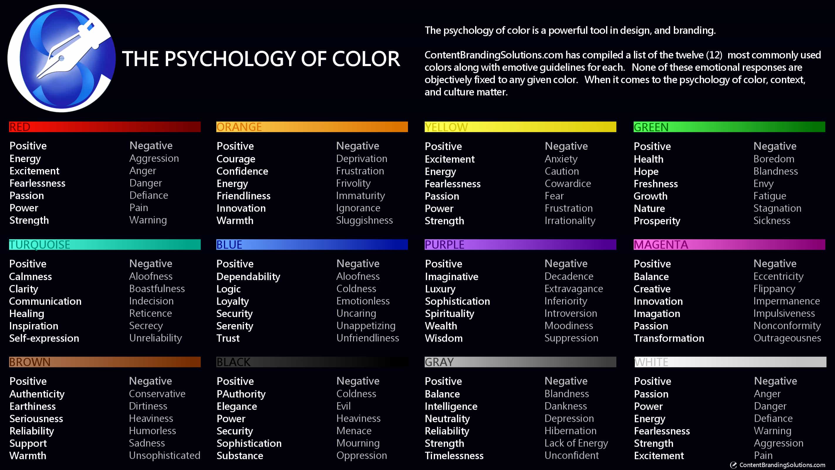
Green is the color of nature and symbolizes Health, Freshness, Nature, Growth, Prosperity, Harmony, Freshness, Fertility, Stability, Endurance, and Safety. Manny people see green and describe it as a refreshing and tranquil color.
- Nature, Calming
- Luck
- Motivating, optimistic
- Safety
- She was green with envy, or she is turning green with jealousy.
- Fertility and creativity
The color green may positively impact our thinking, our relationships, and our physical health. In addition, green is thought to relieve stress and help heal.
- American Psychological Association. Green is good for you. Published 2001.
The Shades and Tones of Green Can Tell Your Story
Green is GO, green is nature, emotionally relaxing and refreshing if that sounds like a match for your products and services, green is for you. As hunter-gatherers, green is hard-wired in us to indicate a place where food and water are plentiful. So how does the psychology of green emotionally affect us?
- Dark green – Boredom, Stagnation, Envy, Blandness, Ambition, Greed, Money, Finance, and Heaviness.
- Yellow-green –Sickness, Cowardice, Discord, and Jealousy
- Olive green – Peace, Military, Nature, and Masculinity
- Bright green – Health, Freshness, Nature, Growth, Prosperity, Harmony, Fertility, Stability, Endurance, Wellness, Excitement, and Safety
- Aqua Green – Emotional Healing and Protection.
Green is often used to indicate safety when advertising drugs and medical products. And since it is directly related to nature, all its shades can be used to promote natural or environmentally-friendly products and organizations.
Dark green found on websites is related to money and finance.
Colors Do Matter in Marketing and Branding
So choose Yours Wisely
NEED HELP IMAGINEERING YOUR BRAND
CALL the Branding Knowledge, Experts
Blue and Green are the colors
of
Thought Leadership, Sustainability, and Nature
▪ Bright green ▪
Health ▪ Freshness ▪ Nature ▪ Growth ▪ Prosperity ▪ Harmony ▪ Stability ▪ Excitement▪ Safety
The Shades and Tones of Blue Can Tell a Story About You
Blue is the color of the sky and sea, so it symbolizes depth, stability, trust, loyalty, wisdom, confidence, intelligence, faith, truth, heaven, tranquility, calmness, and sincerity.
Darker shades of blue are often used by political and patriotic organizations, legal firms, and sports teams. In comparison, lighter shades of blue are commonly used to promote health and wellness, travel, and relaxation.
- Midnight Blue – Boastfulness, Secrecy, Unreliability, Reticence, Indecisiveness, Fence-sitting, Mystery and Aloofness
- Dark Blue-– Knowledge, Power, Security Integrity, Seriousness, Masculinity, Health and Expertise
- Light Blue – Health, Healing, Tranquility, Understanding, and Softness
- Turquoise Blue - Positive Communication, Clarity, Calmness, Inspiration, Self-expression, Healing
Blue is often used across a large variety of websites, from the dark blue of Banks to the light blue of the dentist's office.
Color is a Powerful Communication Tool
Corporations that want you to trust them will use dark blue in their marketing. Blue is the preferred color for commercial, corporate America, from Anthem, Blue Cross to United Health Care, and General Motors. You will find it a lot on big conglomerate company websites using trustworthy blue.
Recently there has been a trend towards more greys and reds, for example, Wells Fargo! Remember to heed the warning sign.
The whole world, as we experience it visually, comes to us through the mystic realm of color...
- Hans Hofmann.
Media and many web industries use medium shades of blue because it can appear to be high-tech when mixed with silver and grey. However, if not used carefully, blue and grey can become cold and push the observer away. When shades of grey, gold, and blue are combined, big investment banks and firms will be on your web browser.
Light blue can be found on websites related to cleanliness, water purification filters, cleaning liquids, and of course, Sky Vodka. Airlines, airports, air conditioners use air and sky blues; water and sea blues are often used to entice you on a voyage or encourage you to drink healthy mineral water.
Expert Tip Remember to drink water responsibly and use a recyclable insulated water bottle instead of plastic. Ask for a glass of water and not a bottle.
The Psychology of Blue in Book Cover Design
Color Symbolism in Design and Marketing- Turquoise Blue - Positive Communication, Clarity, Calmness, Inspiration, Self-expression, and Healing.
Image Source: Book Cover © Peter Lucking | contentbrandingsolutions.com
The Book cover for Tips To Live a Healthy Lifestyle
- Light blue for health, healing, tranquility, with a hint of healthy, relaxing, green, and softness.
- Turquoise Blue for positive communication, clarity, calmness, inspiration, self-expression, healing.
- Clean fresh white
- Add a touch of golden yellow for positive excitement, energy, passion, power, and strength, and you have a robust and powerful image.
>>> On Amazon in time for the Beach Season Plays on Symbols and Emotions. <<<
An Eye-Catching Book Cover
Speaks a thousand Words Touching Your Emotions
Triggering You to Buy
Expert Tip: Choose colors that trigger the right emotional response in your target audience.
Many established high-end private Banks like Coutts & Co Bankers to the British Royalty use a mix of dark blues, golds, and browns to establish long-term trust and sophistication.
NEED HELP IMAGINEERING YOUR BRAND
CALL the Branding Knowledge, Experts
OUR PROMISE as CEOs of Content Branding Solutions TO YOU
-
-
- EXCELLENCE; We are TRANSPARENT and HONEST
All scope fees, charges, and expenses are clearly spelled out before we do business.
- EXCELLENCE; We are TRANSPARENT and HONEST
-
-
-
- PERSONALIZATION, INNOVATION our Team is CLEAR. We take the time to help you see the big picture on Content Brand Marketing.
You will always know exactly where you stand, your options, and why we are taking action.
- PERSONALIZATION, INNOVATION our Team is CLEAR. We take the time to help you see the big picture on Content Brand Marketing.
-
-
-
- INTEGRITY; WE are CONTENT STRATEGIST and BRANDING KNOWLEDGE, EXPERTS
Everything we do for you is always in your firm's best interest.
- INTEGRITY; WE are CONTENT STRATEGIST and BRANDING KNOWLEDGE, EXPERTS
-

The Color Psychology of Blue in Website Development and Design
In DLAA professional AEC website, blues are used as part of the brand voice, from the dark indigo blue text to the blues in the graphics that create a visual identity, convey trust and build equity. We try to make a clear statement that “This is the experienced firm that you can trust and use.”
The long-form landing page is laced with blue. A touch of classic theatre orange-red is used in the CTA to get your attention.
What do you think?
The Psychology of Purple
Speaking of royalty, notice the color purple symbolizes royalty, especially when combined with gold, old money, power, nobility, luxury, ambition, wealth, extravagance, wisdom, dignity. And of course, the Artist, formerly known as Prince the ''Purple Rain'' musician, has independence, creativity, and mystery.
Expert Tip: According to research from Sherwin-Williams, colors that appeal most to women are blue, purple, and green, while orange, brown, and grey are the least appealing.
The Use of Purple in Logos and Website Design
Purple, gold, and the light purple branded logo for Arturo-Jimenez Law firm branding and website by Content branding Solutions
Arturo Jiménez Immigration Law Website, Logo, Content, and Branding by © Content Branding Solutions
Arturo and his wife are fans of the Artist, formerly known as Prince the ''Purple Rain'' musician. The color selected was from the official Pantone based on his piano and trademark glyph called Love Symbol #1—a mash-up of the Mars-male and Venus-female astrological symbols. But, unfortunately, we think Pantone got the color wrong.
Color and Consumer Purchases
Silver: It's the third most popular color for vehicles and is linked to a sense of innovation and modernity.
High tech products are often silver, so the color is often linked to new, modern, and cutting-edge things.
Stevens Gans, MD. Color Psychology: Does It Affect How You Feel?
The Final Cutting Edge product!
Sometimes, the color selected by the client is not the one that we recommend. As an observation, we recommended the use of a light purple and gold as it symbolizes the joy of life, the warmth of the sun, and the glowing femininity of the lady justice. However, as you can see, the results above are quite different.
Arturo is also very swashbuckling, and in the end, he and his wife are happy with the choice.
Expert Tip: Purple and gold and the light purple branded logo are welcoming. Purple and Silver are cold and cutting. However, it is, in the end, the client’s choice. What do you think?
The Psychology of Purple Hues
- Light Purple – romance, nostalgia, the joy of life, and femininity
- Medium Purple (violet) – meditation, creativity, concentration, quietness, beauty, inspiration, artistry, music, chivalry, excellence, ethereal, sensuality, intellectual achievement, responsibility, and sacrifice
Dark Purple – gloom, sadness, frustration, royalty, and richness
- Royal Purple is often associated with legal and aristocratic websites or websites aimed at women.
- Medium Purple is a favorite of Academic institutions who will often use medium shades of purple because this shade of purple has many qualities related to intellectual thought and achievement.
- Lighter shades are often found in high-end spas geared towards women, as well as health and wellness websites.
- Grape/ Dark Red Purple is often used for accents to offset with tiny amounts of pink.
Conclusion
In the 4-part how-to guide to Color Symbolism in Brand IMAGINEERING; we share how it affects Your Brand voice, visual identity, and equity, from logos to website design, BD, marketing, sales, and services. In addition, we answer what color psychology is and how the primary colors influence your emotions, choices, and perceptions.
If You are interested in The Psychology of Colors in Branding and Marketing please check out:
Part 1 Primary Colors - The Psychology of Primary Colors in Branding and Marketing
Part 2 Warm Colors - The Psychology of Warm Colors in Branding and Marketing
Part 3 Cool Colors - The Psychology of Cool Colors in Branding and Marketing
Part 4 Neutral Colors - The Psychology of Neutral Colors in Branding and Marketing
Discover Brand Imagineering
Your Brand Colors and What They Mean to Your Customers
Your Brand Voice, Visual Identity, and Equity
If you enjoyed Part 3 to A how-to guide to Cool Color Psychology in Branding, Marketing, and Sales with examples and tips for Your Logos, Copy, Web design, book covers, graphics, etc. Please share and read the other blogs.
Please join us next week when we will look at "Neutral" Colors from slate grey to black... the impact that color has on marketing and advertising.
In this 4 part, how-to-guide, we share the best ways to find and select your brand color pallet with the twelve (12) most used colors and the emotions to create your branding color scheme from Content Branding Solutions
We show proven expert tips to consider when using color in content creation and marketing and sales copy, websites, website design, book covers, logos, download, and sales buttons to get you the results and benefits you and your brand deserve.
We provide Expert Tips That have value, with proven benefits to consider when using color for logos, website development, design, book covers, marketing graphics for social media, LinkedIn, Twitter, Meta (Facebook), etc.
In Part 3 to A how-to guide to Cool Color Psychology in Branding, Marketing, and Sales dealt with:
Cool Color Psychology, Psychology of Cool Colors, Psychology of Warm Colors, Color psychology, color in branding, psychology of color, psychology of color in branding, brand Imagineering, color psychology, Color Symbolism in Branding, Color Symbolism in Brand IMAGINEERING, color in content creation, Color Symbolism in Design and Marketing, Color Symbolism in Marketing.
References
American Psychological Association. Green is good for you. Published 2001.
The very well mind Color Psychology: Does It Affect How You Feel? How Colors Impact Moods, Feelings, and Behaviors

